-in-formação
 Tristan Tzara |
|---|
Tristan Tzara (ou Samy Rosenstock, Moinesti, Romênia, 1896 – Paris, 1963) foi um poeta judeu e francês que nasceu em Moinesti, na Romênia, e faleceu em Paris aos 67 anos de idade. Foi um dos iniciadores do Dadaísmo.
Em 1916 em plena 1ª Guerra Mundial (1914- 1918) que durou 4 anos e da qual participaram 18 países iniciada com
o Atentado de Sarajevo e finalizada com a rendição dos alemães no Sudoeste Africano, um grupo de de refugiados em Zurique, na Suíça, iniciou o movimento artístico e literário chamado Dadaísmo.
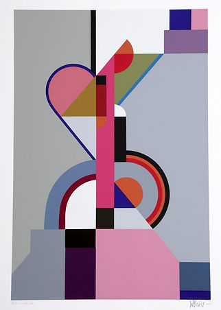
Cinema Calendar Of The Abstract Heart - 09
"the fibres give in to your starry warmth a lamp is called green and sees carefully stepping into a season of fever the wind has swept the rivers' magic and i've perforated the nerve by the clear frozen lake has snapped the sabre but the dance round terrace tables shuts in the shock of the marble shudder new sober."
Tristan Tzara
 Lazslo Moholy Nagy |
|---|
Moholy foi um pintor, escultor, e artista experimental húngaro que chegou a ser professor na Bauhaus. Desenvolveu filmes experimentais, tipografia, fotografia, entre outras.
Em 1935 mudou-se para Londres onde integrou o grupo construtivista responsável pela publicação do periódico Circle. Em 1937 emigrou para Chicago, onde se tornou o director da New Bauhaus e fundou o Instituto de Design.
Ao longo da sua vida dedicou-se muito á tipografia, o que o levou a trabalahr tambem na fotografia e fotomontagem. O conceito de uma nova tipografia ocupava um papel central nos seus manifestos : "Die neue typographie" foi um deles, sendo publicado em 1923 no bauhausbuch, foi um artigo que articulou ideias essencias da nova tipografia.
Para Moholy-Nagy, a fotografia, os fotogramas e fotomontagens ofereciam um novo modo de ver, um novo processo de tornar credível e compreensível a comunicação, "The photographic camera can either complete or supplement our optical instrument, the eye." Desde o princípio, Moholy-Nagy percebeu que a luz deveria ser considerada um meio, uma construtora da form, "The use of light as a creative agent».
O fotograma, para Moholy-Nagy, era, "a record of forms produced by light, which embodies the unique nature of the photographic process, is the real key to photography". Colocava objectos tridimensionais (opacos, transparentes, sólidos, lisos, texturizados, lineares...) sobre um papel foto-sensível, e a luz que incidia sobre os objectos era modulada para criar inúmeros efeitos, contrates e variações de cinzentos.
 Typo Photo"What is typophoto? Typography is communication composed in type. Photography is the visual presentation of what can be optically apprehended. Typophoto is the visually most exact rendering of communication." Laszlo Moholy Nagy |
|---|


 Walter Dexel |
|---|
Walter Dexel is one of the outstanding exponents of 1920s Constructivism.
As a painter Dexel was an autodidact.
He studied art history under Heinrich Wölfflin and Fritz Burger in Munich from 1910 to 1914. At the same time
he received private drawing classes from H. Gröber. In 1916 Walter Dexel graduated from university with
a doctorate under Botho Gräf.
In 1912/13 he produced his first pictures during a study trip to Italy. His early pictures were influenced by Cézanne's landscapes, with his later work being influenced by Cubism and Expressionism. In 1914 Dexel held his first individual exhibition with Cubist pictures at the "Galerie Dietzel" in Munich.
In 1918 Walter Dexel became head
of exhibitions in Jena, where he organised first exhbitions with Campendonk and later with Bauhaus artists like Moholy-Nagy. In the early 1920s Dexel's work moves on
to Constructivism, which he approaches
in a comprehensive way.
Walter Dexel was not restricted to panel paintings but also worked
as a typographer, an advertising designer and designed interiors and stage settings. In 1928 he wrote a book entitled "Das Wohnhaus von Heute" together with his wife Grete Dexel, which reflects the artist's interest in the issues of modern living, which the artist showed from an early age.


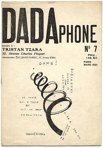
Dada 7 (Dadaphone), ed. Tristan Tzara (Paris, March 1920), cover
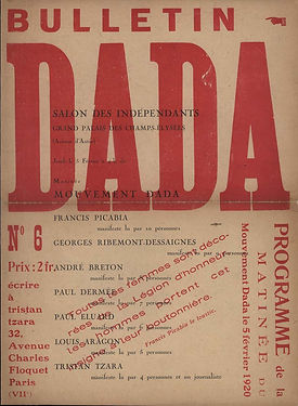
Dada 6 (Bulletin Dada), ed. Tristan Tzara
(Paris, February 1920), cover.

Tristan TzaraRomanian, 1896–1963Poster for Salon Dada, Exposition Internationale, Galerie Montaigne, 1921

Raoul HausmannAustrian, 1886–1971Mechanischer Kopf (Der Geist unserer Zeit) (Mechanical Head [The Spirit of Our Age]), c.1920hairdresser's wig-making dummy, crocodile wallet, ruler,
pocket watch mechanism.


Hugo Ball, German, 1886–1927Proof sheet for the projected anthology Dadaco, edited by George Grosz, John Heartfield, et al., 1919. Publication planned by Kurt Wolff Verlag, Munich, January 1920, but abandoned.
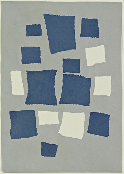
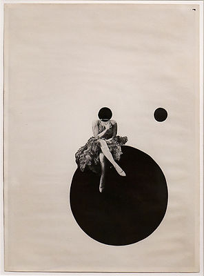
Hans ArpFrench, 1886–1966Untitled (Collage with Squares Arranged According to the Laws of Chance)collage of torn papers on paper
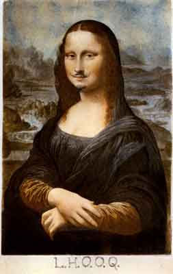
Marcel DuchampFrench, 1887–1968L.H.O.O.Q., 1919
rectified readymade: pencil on reproduction of Leonardo da Vinci's Mona Lisa
Man Ray, American, 1890–1976. Untitled (Woman smoking cigarette), 1920, gelatin silver print
Raoul Hausmann, Austrian, 1886–1971Der Kunstreporter (The Art Critic), 1919–1920 photomontage and collage with ink stamp and crayon on printed poster poem
Hans Arp and Sophie TaeuberFrench, 1886–1966; Swiss 1889–1943 Untitled (Duo-Collage), 1918collage of paper, board, and silver leaf on board
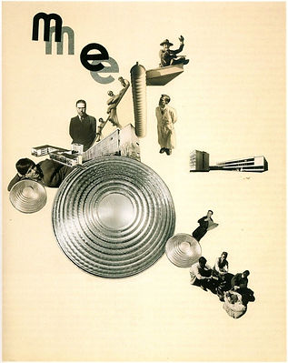
Marianne Brandt, ME (Metal Workshop), 1928
László Moholy-Nagy, The Structure of the World, 1927
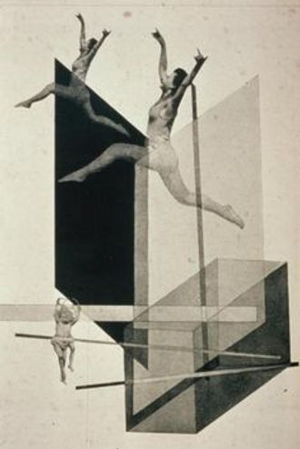
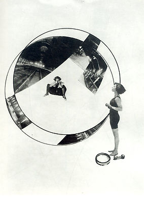
László Moholy-Nagy, Human Mechanics, 1920s
László Moholy-Nagy-Love Your Neighbor; Murder on the RailwayLove Your Neighbor; Murder on the Railway, 1925

László Moholy-Nagy – Olly and Dolly Sisters, ca. 1925, Gemeentemuseum Den Haag
László Moholy-Nagy - Die Korsettstange, 1925 – 1927
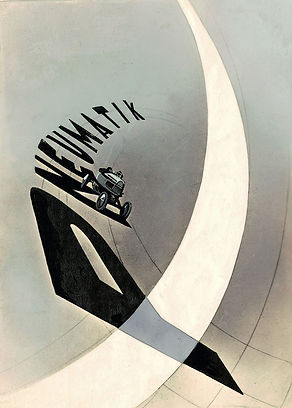
László Moholy-Nagy - Pneumatic tires, typophoto, 1923
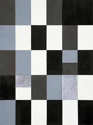
Walter Dexel’s cubist silkscreens, 1973
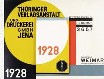
Walter Dexel, wall calendar for the Thüringer Verlagsanstalt und Druckerei. Jena, 1928
Walter Dexel, Reklameuhren, new clocks for out-of-home advertising & Hans Leistikow’s artwork for a Lottery, published in the design magazine Das neue Frankfurt, 1926
Walter Dexel, Bootlegger, Der Schwarzhändler, 1971
 New-Wave TypographyWolfgang Weingart "New-Wave typography questioned the formal way text appeared on the page. He discarded the indent for a paragraph, wide letter spacing appeared more and the emphasis of one word in a headline. The types of design he created he called, bunny types, sunshine type, ant type, five-minute type, typewriter type, and the for-the-people type. The New-Wave strongly rejected style and saw it more as an attempt to expand typographic communication." |
|---|


Walter Dexel, Bootlegger, Der Schwarzhändler, 1971
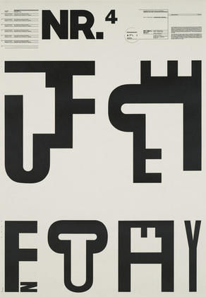
Nr.4 / 1971-1972 | Wolfgang Weingart MoMA | The Collection | Wolfgang Weingart. Typographic Process, Nr.4 Typographic Signs
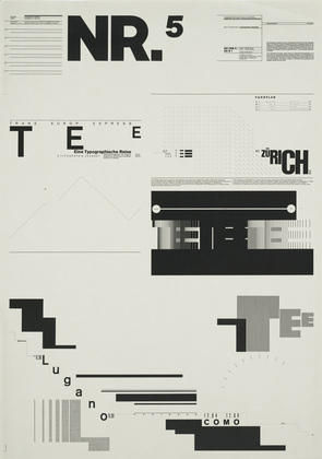
Nr.5 / 1971-1974 | Wolfgang Weingart MoMA | The Collection | Wolfgang Weingart. Typographic Process, Nr.5 Typography as (Painting)
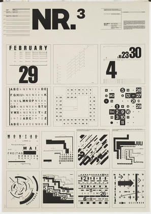
Nr.3 / 1971-1972 | Wolfgang Weingart MoMA | The Collection | Wolfgang Weingart. Typographic Process, Nr 3. Calender Text Structures
Nr.2 / 1973 | Wolfgang Weingart MoMA | The Collection | Wolfgang Weingart. Typographic Process, Nr.2 From Simple to Complex
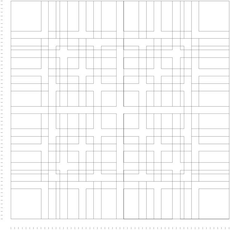 The Griddesigning programs Grid diagram, 1963 (redrawn). Designer: Karl Gerstner. Publisher: Arthur Niggli, Zurich. This square grid consists of six vertical columns and six horizontal modules, overlayed by grids of one, two, three, and four units. Vertically, the grid is governed by a 10-pt measure, which would determine the spacing of type from baseline to baseline. |
|---|
Karl Gerstner grid, Thinking with Type
 Swiss Style |
|---|
What is new in this art is its almost mathematical clarity. The Swiss style does not simply describe a style of graphic design made in Switzerland. It became famous through the art of very talented Swiss graphic designers. This style in art, architecture and culture became an ‘international’ style after 1950’s and it was produced by artists all around the globe. Despite that, people still refer to it as the Swiss Style. This progressive, radical movement in graphic design is not concerned with the graphic design in Switzerland, but rather with the new style that had been proposed, attacked and defended in the 1920s in Switzerland. Keen attention to detail, precision, craft skills, system of education and technical training, a high standard of printing as well as a clear refined and inventive lettering and typography laid out a foundation for a new movement that has been exported worldwide in 1960s to become an international style.
Emerging from the modernist and constructivist ideals, the Swiss Style can be defined as an authentic pursue for simplicity – the beauty in the underlines of a purpose, not beauty as a purpose in itself. The principle “form follows function” became a battle cry of Modernist architects after the 1930s. As a consequence of this principle, most of the Swiss Style craft is devoted to the minimal elements of style such as typography and content layout rather than on textures and illustrations.
As a graphic designer, Müller Brockmann's skills included letterpress, silkscreen, and lithography. His geometric style was demonstrated in “Musica viva”, a series of concert posters for the Zurich Tonhalle in 1951.
The style had to incorporate mathematical methods of spatial organization into graphic work, which drew on the language of Constructivism to create a visual correlative to the structural harmonies of the music. Müller Brockmann's 1955 poster, Beethoven, was supposed to portray Beethoven's music through a series of concentric curves, and has been offered as an example such an adaptation, and this assertion had been accepted at its face value by many pundits, who were impressed by the novelty, elegance and the simplicity of design. As Müller Brockmann has stated:
‘In my designs for posters, advertisements, brochures and exhibitions, subjectivity is suppressed in favour of a geometric grid that determines the arrangement of the type and images. The grid is an organisational system that makes it easier to read the message...The grid is an organisational system that enables you to achieve an orderly result at a minimum cost. The task is solved more easily, faster and better. It brings the arbitrary organisation of text into a logical system in keeping with the conflict. It can demonstrate uniformity that reaches beyond national boundaries, a boon to advertising from which IBM, for instance, has profited. Objective-rational design means legible design, objective information that is communicated without superlatives or emotional subjectivity.‘
 Josef Müller BrockmannRoad safety poster ‘Overtake? If in doubt, don’t’ |
|---|

Poster ‘Musica Viva’ by Josef Muller-Brockmann 1958. One of a series of posters. In this design he uses abstract yet very simple design by adding geometrical shapes and simple typeface. He showed the shapes in different sizes to show the different music type.
Poster for the Baseltheater by Armin Hofmann, 1959.An organic, kinetic,and soft photographic image contrasts intensely with geometric, static,and hard-edgedtypographic shapes

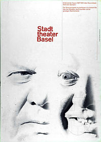
Municipal Theater Basel1959, Poster for theseason 1960/61by Armin Hofmann.During the theater season, the weekly program was pasted in the black vertical section of the letter T.Off season, the text reminds the viewerto watch this space for the upcoming program.
Giselle - Poster for an open-air ballet performance, designed by Armin Hermann, 1959. One of the defining images of Swiss graphic design, each element contributes to its dramatic elegance. The brilliant white of the lettering is a foil to the half-tone greys of the photograph; the dancer, cut off at head and foot, is transformed in to a graphic sign of movement rather than a three dimensional pictorial image, emphasized by the round forms of the letters and further accentuated by the clean geometry of the ‘i’ and the two ´i´ and, most ingeniously, by Hofmann´s substituting a circle as the dot on the ‘i´ in place of the conventional square.
